By GDP or GNI per capita, the US was for a long time the undisputed front-runner of the world economy, surpassed only recently by a few small countries that became rich due to their oil wealth (Kuwait and Norway, for example) or their financial prowess (Luxembourg). Per-capita GDP or GNI continue to be prevalent in economic policy analysis, apparently because of convention and easy availability of data. When GDP and GNI at market prices and exchange rates were seen to significantly overstate the income differences between rich countries and poor, economists promptly made adjustments for purchasing power. The Penn World Tables adjust national accounts, country by country, in their own currencies by using detailed price data to produce real national accounts in a common currency (US dollars), covering 182 countries from 1950 to 2014. Even so, PPP-adjusted national accounts data as reported by the World Bank and the IMF reach back only to 1990. Thus World Bank and IMF national income data between 1960 and 1990 is not PPP-adjusted.
Stocks matter for flows, and vice versa
To improve their national accounts, some countries have made adjustments for home production and the informal economy (Schneider, 2007). We do not yet have internationally standardised green national accounts that take environmental degradation into consideration, but the World Bank (2006) has measured different kinds of capital, including natural, human, and social capital, to permit adjustments to national accounts for changes in national assets and liabilities. If two countries have identical incomes, but one of them runs down its national assets (environment, natural resources, human capital, societal institutions, infrastructure or public trust) or piles up foreign debts, then the country that maintains its national assets and liabilities is clearly in a stronger economic position – even if national accounts fail to chart the difference. Put differently, sustainable development matters.
Introducing other dimensions
In finance, no one would consider judging an asset solely by its return. Assets need to be assessed in two dimensions: by their return as well as the associated risk. Stiglitz, Sen, and Fitoussi (2010) and Deaton (2013) among others, argue that economic indicators and social indicators, when viewed jointly, provide a clearer picture of a country´s economic standing. If two countries have the same per capita income, but one of them is able to offer its people better education and longer lives, then the latter country is clearly better off. In this spirit, the UN Human Development Index (HDI) weighs incomes, education, and health in equal proportions to produce a broader index of the standard of life than income alone would do.
Likewise, a nation´s economy needs to be judged not only by the incomes generated or consumption enjoyed by its people, but also by the distribution of the nation´s income and consumption across the population as measured, for example, by the Gini index (Gylfason 2007). The Gini index is closely correlated with other common measures of dispersion. Thus, a balanced comparison of the economic performance of Europe, Japan, and the US needs to take distribution into account.
To investigate this, I compared purchasing power of national income per hour worked across the G8 countries: Canada, France, Germany, Italy, Japan, Russia, the UK, and the US. I compared income per hour worked rather than per capita, because this reflects economic efficiency – in other words, the effort behind the income earned. Below I adjust the results for inequality, as well as for social measures such as education and health.
Income per capita vs. income per hours worked
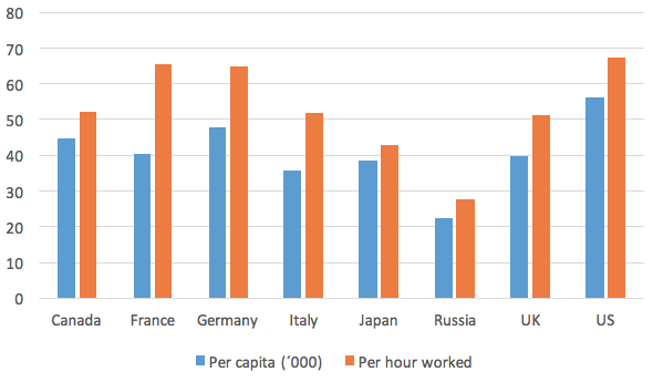
Figure 1 shows the purchasing power of income per person, and per hour worked, in the G8 countries in 2014. The measure of hours used is hours actually worked, including paid overtime and not including paid hours not worked due to sickness, holidays, and so on. The US continued to lead the G8 countries in terms of GNI per capita in 2014 (the blue columns) but Germany and France are almost equal in terms of GNI per hour worked (the red columns). Americans work longer hours (1,800 per year in 2014) than in Europe (1,700 in Italy and the UK, 1,500 in France, 1,400 in Germany). Further, partly because European workers retire earlier than American workers, labour force participation rates are higher in the US (63%, equal to the UK) than on the European continent (60% in Germany, 56% in France, 49% in Italy). One likely reason why Americans work longer hours and retire later than many Europeans is that many Americans lack the social security that most Europeans take for granted. The pattern is complicated slightly, however, by the fact that unemployment is lower in the US (6% in 2014, as in the UK) than in parts of the European continent (10% in France, 12% in Italy, although 5% in Germany). While France and Germany are roughly equal to the US in income per hour worked, this adjustment means that Italy rises from 63% of the US income level to 77%, and the UK rises from 71% to 76%.
Figure 1. GNI per capita and per hour worked 2014 (current USD, PPP)
Source: World Bank, World Economic Indicators (blue columns) and The Conference Board Total Economy Database™, May 2016 (red columns).
But income per hour worked, like GNI per capita, is a one-dimensional measure, so we can adjust these statistics for education and health, as in the HDI. The HDI is defined as a geometric average of three component indices reflecting GNI per person, education (an average of mean years of schooling for adults aged 25 years and more and expected years of schooling for children of school entering age), and health (life expectancy). On average, except for Russia, Europeans live two to four years longer than Americans. The UN inequality-adjusted HDI is then defined as a geometric average of three component indices as before, where each of the three components is adjusted downward to a degree that reflects the inequality of the distribution of each variable across the population.
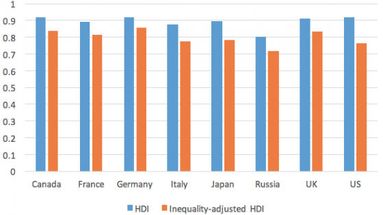
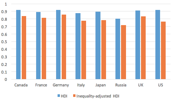
Adjusting the HDI for inequality affects the rankings. Figure 2 shows how the US drops from a first-place tie in the G8 with Canada and Germany based on the unadjusted HDI (the blue columns) to the second lowest ranking based on the inequality-adjusted HDI, followed only by Russia (the red columns). Globally, the US rank drops 20 places when the HDI is adjusted for inequality, from 8 to 28, while France´s rank remains unchanged at 22. Germany also remains unchanged at 6 while Italy drops one point from 27 to a tie with the US at 28.
Figure 2. HDI and inequality-adjusted HDI 2014
Source: United Nations Development Program.
While these adjustments for education, health, and equality broaden the measure of economic success, but we can still make an adjustment for income per hour worked, rather than per-capita income. In keeping with an inequality-adjusted HDI, inequality-adjusted income per hour worked is just the raw measure multiplied by ‘one minus the Gini coefficient’. This compresses the two dimensions into one. The Gini index is closely correlated with other standard measures of dispersion such as the standard deviation of incomes around the mean or the 20/20 ratio (the ratio of the share of the richest 20% of the population in GNI divided by the share of the poorest 20%).
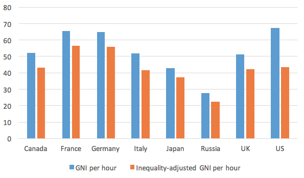
Figure 3 shows GNI per hour worked and inequality-adjusted GNI per hour worked in 2014 side by side, based on the HDI measure of income inequality. This measure of inequality differs slightly from the Gini index for 2005-2013 (UNDP 2015) and also from the most recent Gini indices reported by the World Bank. Without the adjustment for inequality (the blue columns), the US leads France and Germany, as in Figure 1. After the inequality adjustment (the red columns) the US falls to third, after Germany and France. It remains slightly ahead of the UK, Canada, Italy, Japan, and Russia.
Figure 3. GNI per hour worked and inequality-adjusted GNI per hour worked 2014 (2015 USD, ppp)
Source: Author’s computations based on sources behind Figures 1 and 2.
Note: The blue columns in Figure 3 are the same as the red columns in Figure 1.
HDI adjusted for hours worked
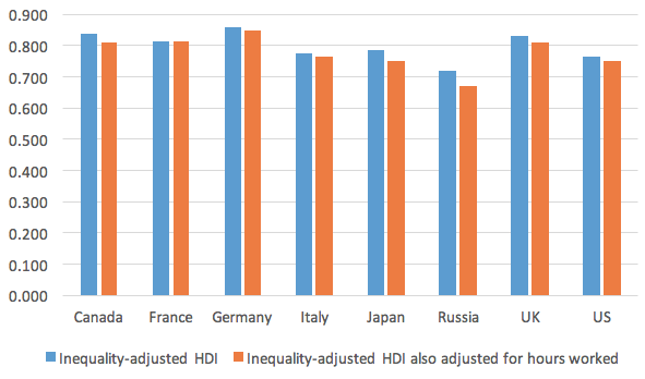
To combine inequality adjustments with adjustments for income per hour worked, I computed an index for income per hour worked to replace the per-capita GNI index behind the HDI, then multiplied the outcome by (1 – Gini) to adjust for inequality, and substituting the result for the income component in the formula for the inequality-adjusted HDI. This gives an estimate of an HDI doubly adjusted for inequality as well as for hours worked (Gylfason 2016).
Figure 4 shows an inequality-adjusted HDI weighing together income, education attainment and life expectancy, and relying on the purchasing power of income per hour worked rather than of income per capita. These considerations dramatically change the relative positions of the countries. Most significantly adjusting for hours and inequality, as well as for education and health, relegates the US to seventh place among the G8 countries. It is ahead only of Russia.
Figure 4. Inequality-adjusted HDI, also adjusted for hours worked 2014 (2015 USD, ppp)
Source: Author’s computations based on sources behind Figures 1-3.
The distribution of income, wealth and various social indicators are now in the mainstream of economic and political analysis. Distribution, education, and health need to be taken into account in statistical cross-country comparisons of economic performance. Viewed through such lenses, compared with the US, Europe appears to be doing well after all.
References
Conference Board (2015), The Conference Board Total Economy Database, accessed 8 July 2016.
Deaton, A. (2013), The Great Escape: Health, Wealth, and the Origins of Inequality, Princeton University Press, Princeton and Oxford.
Gylfason, T. (2007), “Why Europe Works Less and Grows Taller,” Challenge, January-February, 21-39.
Gylfason, T. (2016), “Efficiency, Fairness, and Social Cohesion in Europe and the United States: Incomes, Hours of Work, and Equality with an Afterthought on Iceland,” CESifo Working Paper No. 6025, August.
Schneider, F. (2007), “Shadow Economies and Corruption All Over the World: New Estimates for 145 Countries,” Economics: The Open-Access, Open-Assessment E-Journal, July, Vol. 1, No. 2007-9, 1-66.
Stiglitz, J. E., A. Sen, and J.-P. Fitoussi (2010), Mismeasuring Our Lives: Why GDP Doesn’t Add Up, Report by the Commission on the Measurement of Economic Performance and Social Progress, The New Press, New York.
United Nations Development Program (2015), Human development Report.
World Bank (2006), Where Is the Wealth of Nations? Measuring Capital for the 21st Century, Washington, D.C.
